Asian Art Forums
Asianart.com | Associations | Articles | Exhibitions | Galleries |
Visitors' Forum |
| Message Listing by Date: |
|
|
Message Index |
Back |
Post a New Message
| Search | Private Mail
| FAQ
|
|
|
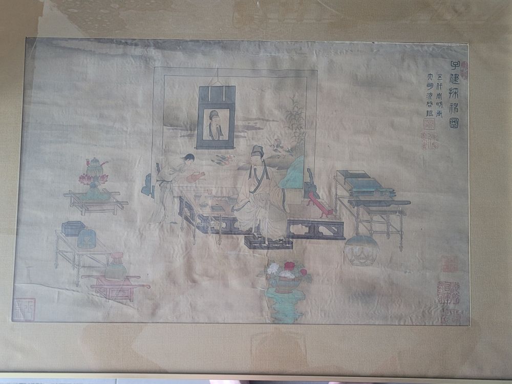
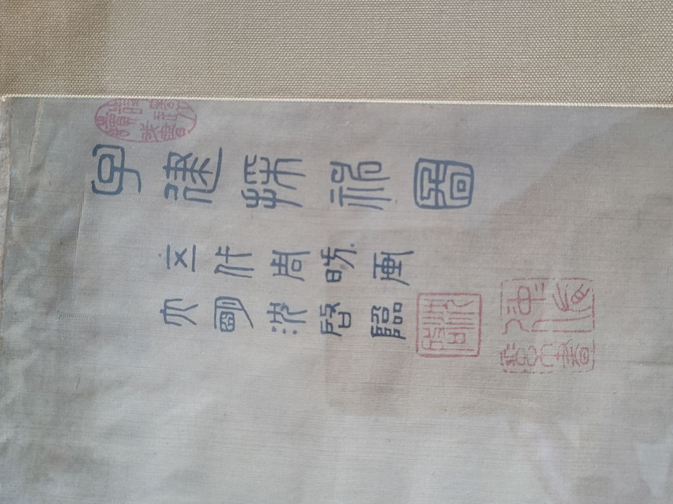
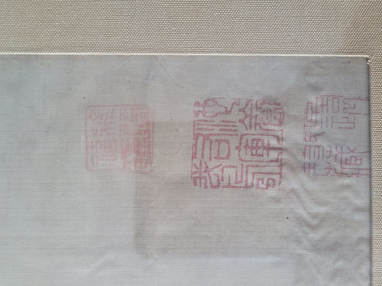
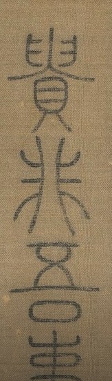
Subject:Identification and translation Ming painting
Posted By: taleb mouhamed Wed, May 07, 2025 IP: 85.170.112.146 hello, I have for some time this beautiful painting apparently from the Ming era. I would have your opinion enlightened about it. As well as the translation and ideally the identification of signatures and stamps present. Thank you |
|
|
Subject:Re: Identification and translation Ming painting
Posted By: rat Wed, May 07, 2025 Hello, |
|
|
Subject:Re: Identification and translation Ming painting
Posted By: I.Nagy Wed, May 07, 2025 I do have doubts about its originality. |
|
|
Subject:Re: Identification and translation Ming painting
Posted By: taleb mouhamed Thu, May 08, 2025 hello. First of all, thank you for your quick and precise answers. I had already noticed the existence of a similar painting from the Song period, or Tang. I also saw the famous painting of Qianlong. |
|
|
Subject:Re: Identification and translation Ming painting
Posted By: rat Sun, May 11, 2025 I agree with your observations about the differences between your picture and the anonymous Song album leaf on which it is based, but I think that yours is instead copying the album leaf formerly in the Tianlaige collection and not the Song album leaf in the NPM (see the link to the German auction listing of the Tianlaige compilation; among the images there is the album leaf in question). |
Asianart.com | Associations | Articles | Exhibitions | Galleries | |